Why You Don’t Want a Picture That Tells a Thousand Words
Over 65% of the world’s population are visual learners. Whether it’s in a classroom or out in the big wide world we are bombarded with visual queues that stimulate our senses. If I mention your favourite colour or food, 65% of you are visualising it right now.
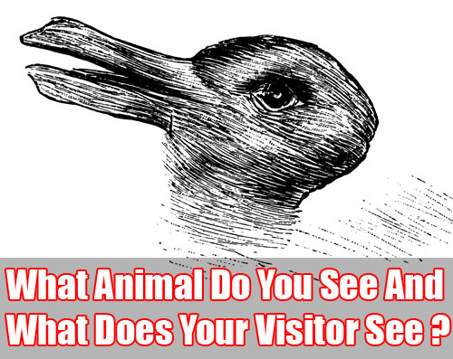
Where it gets interesting is how I visualise that food may be very different to how you visualise that exact same meal. Components of that meal may appeal to me and at the same time you may totally disregard them in preference to another part that draws your attention.
So this raises the question… if I wanted you to focus on the key elements of an image and to link those images to the message I’m trying to get across, what other supporting methods could I use?
Furthermore, if you’re looking at achieving this online what steps do you need to take to capture your visitors.

A Picture Can Tell a Thousand Words
Let’s be honest… most people seem to have attention deficit when they’re surfing the web. There are simply too many distractions and in the online world it’s easy to get hit with information overload.
Using images can help catch the attention of visitors, but when it comes to a website it’s important to focus on the type and use of those images. Your website is your representation on the web. Everything that you put on there must be representative of you whilst ensuring you’re not confusing and befuddling your visitor.
To better understand this we first need to look at the concept of above and below the fold.
Above the Fold Design
Steve Thompson coined the term ‘Above The Fold’ (in 2000) for web development, to refer to that portion of the webpage that you see without scrolling down. This portion changes from one screen resolution to the next with 90% of screens with a resolution higher than 1024 x 768 (as of 2013).
In earlier days of the internet, it has been suggested as a standard to put everything above the fold to save people from scrolling down. This still holds true today, with the average internet user clicking making their decisions based on the information instantly presented too them above the fold.
As this is the first thing that a first-time visitor sees it’s important to consider how a visitor to your site would react when they first visit your site and whether you present the most important points ‘above the fold’ to make it easy as possible for them to navigate your site.

You Only Have One Chance To Make A First Impression
A common issue we come across (which is now improving – thank goodness) is the use of a massive image above the fold (this was very common in Real Estate). No explanation, just a dirty big image that shows a picture of local scenery. What does it mean? Who Knows?
Sure there are a few sites this idea works on (like photographers and clothing shopping carts) but on the whole it’s simply a waste of space and opportunity.
A Little Research
To gain a better understanding, I started doing a little of my own research by asking website owners their reason behind adding a big non-descriptive image that takes up most of their space above the fold.
I asked 27 business owners why they used big images with no real message attached to them and the most common response.
Not surprisingly, one of the most common answers I received is the ‘a picture tells a thousand words’.
It seems almost as if someone at the top passed this concept down and so many people not understanding how to fill the space effectively used the term ‘a picture tells a thousand words’ as they simply did not know how else to respond.
Let me share another example.
I recently spoke with a lawyer that had a massive stock image of a happy family on the homepage of his site. I always had a perception of a lawyer as someone professional, older, well-read, etc. Yet to the business owner this image represented freedom, a stress free environment, family, love and so on.
See how the gap could easily be formed?
What the business owner perceived or what they’re trying to project is not always what the user or the viewer will get.

Proper Use of Images
When designing a web page, it’s important to think about your user (the person that visits the site). Understand that you are dealing with different types of people, coming from different backgrounds and exposed to different experiences that are not the same as yours. It would be dangerous to assume that they think the same way you do.
If you are going to use images on your site, you need to remember some important points:
• Don’t let the image take over the site. Whilst your site may look fancy and pretty, make sure that it’s also functional. Avoid using extremely large images that takes all the attention of the user. Can you use large images on your website? Yes, as long as it’s a supportive image that displays a clear message about your products and services (like a gallery).
• Overlay text on your images. There is nothing wrong with using images, but make sure that your message is clear. You can do this by overlaying text on the image. This will direct the thought of the viewer.
• If the page, particularly the homepage, is carrying a big image, it has to be clear and direct to the point. Avoid using images that can confusing or send varying messages to the user. Also ensure that big image isn’t negatively affecting the load times of your site as your visitor could leave your page due to their lack of patience.
• Whilst you can add images with text overlay avoid replacing paragraphs of text with text in images. Remember, we have to consider the Search Engines too and they need text to understand your sites theme.
• Every image ‘above the fold’ should be an opportunity to lead a person through your sales funnel or to re-enforce your product or service. Make sure you use that space wisely as it’s your chance to show people that your business is all about.
• Your banner should clearly display the main method you would like people to use to get in contact with you. If it’s your phone number it would mean anyone visiting any page on your site could pick up the phone and immediately give you a call. This makes it as easy as possible for people to deal with you.

Creating a successful website involves real science combined with testing and measuring. By following a few simple elements within your images you can dramatically increase conversions from your site (and lead people down a funnel to whatever goal you would like to achieve).
Consider the most successful websites (for example Ebay or Amazon). Notice their pages are not dominated by huge images and every image contains a description as opposed to leaving it up to the end user to figure it out.
A picture tells a thousand words. Why not invest a little time to narrow it down from those thousand words to offer a clear, concise message that explains exactly what those images are all about?