The Growth of Mobile Users and Mobile SEO
When I was a kid I loved watching Star Trek. The idea of mini computers you could hold in your hand (called tricorders and communicators) to communicate, interact with the environment and to use as a medical tool seemed so futuristic. All I ever wanted as a kid was my own tricorder.
Fast forward to 2013 and while we still don’t have transporters, the whole idea or concept of a tricorders and communicators are old school as the worlds population use something far more advanced… A Smart Phone!

Although the text on their phones is way harder to read than the text on a regular PC, users feel the need to connect anytime, anywhere and is a major player driving technology right now.
They just NEED to update their Facebook status right away, tweet about the traffic, upload a picture of their fancy dinner, take a selfie to Instagram it, or check in on Foursquare at a fastfood chain. And while you used to do that on your desktop (just a few years ago), using your desktop in younger eyes is seen as and archaic thing of the past.
The Cold Hard Data On Smartphones
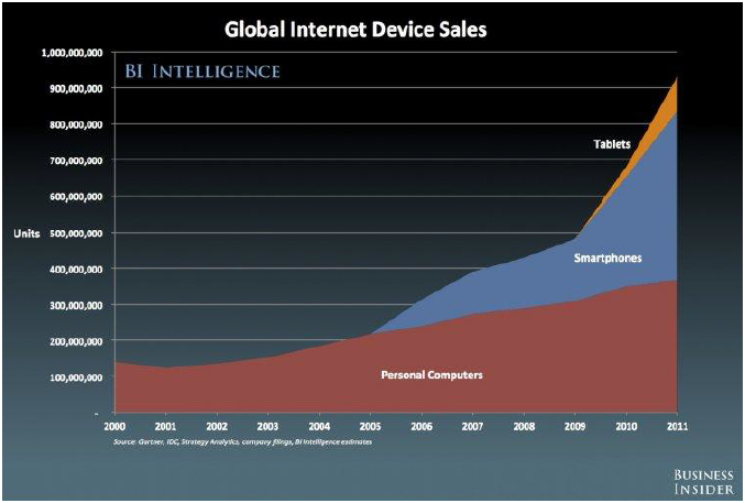
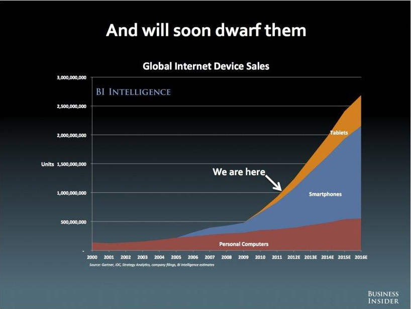
A recent survey (from BI Intellegence) supports this dramatic increase of smart phone users.

Although Ericsson were the first phone company to release what they called a ’Smart Phone’ in 1997, noticeable growth started in 2005 and then rapid growth in 2007 with the introduction of the first iPhone.
This started a massive upward spike to the end of 2011, where Smartphone sales outnumbered the sale of desktop computers. This trend is expected to continue as users shift away from desktops and laptops, toward Smart phones and tablets (as you can see by the sharp growth of laptops).

The rapid growth of smart phones can be accredited to the new sleek designs, new applications, better mobile OS, more affordable prices, Convenience and User Experience.
Even more recently, the heated competition between Apple and Android is making things better for consumers as they get better products and better choices as both companies try to out do each other.
What Do Users Do With Their Mobiles?
Many smartphone users have an ongoing relationship with their phone. Their phone is the first thing they see in the morning and the last thing they look at before they go to sleep. Whether on the toilet or out for a walk, people feel the need to stay ‘CONNECTED!’
So, what are the top activities people do on mobile devices?
Mostly, they play games, listen to music, share and look at pictures, engage social networks like Facebook and Twitter, browsing the Internet and watch movies.
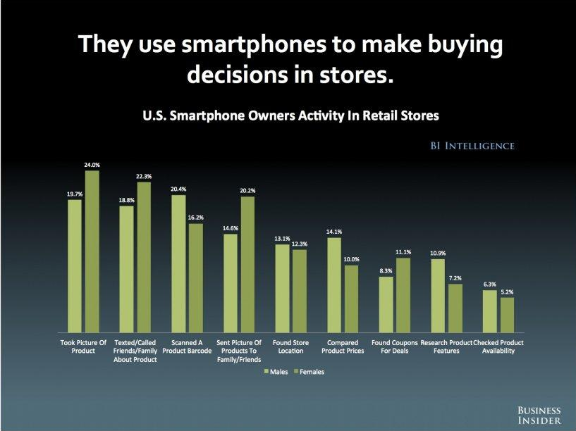
It’s important to note that people are also shopping more using their phones. This is a combination of reference shopping (reviews, investigating, forums) designed to form an opinion of their final purchase or decision. For businesses, this still means huge opportunities to expand reach online as long as you’re developing a smart phone strategy as a part of your overall plan.
Designing and SEO for Mobile
When it comes to SEO and mobile, there are a few ‘house keeping’ rules to consider to ensure your online presence is optimised for a smaller device, but also to make it as easy as possible for the search engines to find.
Fortunately the search engines are pretty transparent when it comes to what they want and Google have released a whole bunch of literature around the subject.
A few points from their documentation:
• Google uses a different bot or spider for mobile sites. You may have a mobile version of your website, but are you sure it’s being crawled by Google? For mobile sites, Google is using Googlebot-Mobile for indexing pages.
If it’s a new mobile site, you can submit a sitemap to Google Webmaster Tools just like you would in the case of a regular website.
Test against site:operator to check if your mobile site is being crawled. If the mobile site is not appearing, it could be that something is blocking Google’s mobile crawler. Make sure that you are allowing Googlebot-Mobile to access your site.
• No flash support. Some videos are not playing on some smartphones because the platform does not support flash. Furthermore flash is not as transparent to the search engines (and is old clunky technology). In order to offer a more universal experience (and make it easier for the search engines) you should consider other Search Engine compliant technologies (like HTML 5).
• Serving different URLs. The mobile version of a site can be structured in many ways, but one of the more common methods is to place the mobile version under a different URL path, for example m.example.com. You could potentially end up creating 2 sites under the same URL.
The search engines are very specific here and would prefer the same content on the 2 sites. If you are optimising for a more compact experience on your mobile version, use the same content snippets to ensure Google don’t think you’re trying to fool them in some way.
One last point… If you are cross-referencing within your site, you have to make sure that your mobile version links to a desktop-enabled site. This will allow your end user to visit your desktop version, and will also allow Google to access (and cross reference the 2 versions easily.
Is Responsive Design the Answer?
Currently, there is no single standard for mobile friendly web page design. Google’s number 1 recommendation for mobile sites is the responsive design. Basically, responsive design adjusts the presentation of the webpage depending on the resolution of the device.
In responsive design, you are only using one HTML and serving one URL for the desktop and mobile version. This is made possible by some changes in the CSS (this is the code that defines the layout of the site). For example, instead of using the ‘width’ attribute, you use ‘max-width’, and instead of ‘height’, ‘min-height’ is used.
This makes it less complicated to deal with Google crawlers. Because there’s only one URL for both desktop and mobile versions, it’s also easier for users to interact with your website. There won’t be any need for complicated redirects.
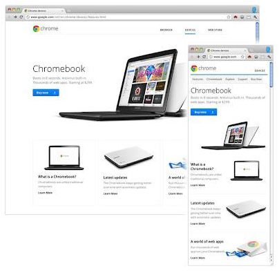
If you want a quick illustration of how responsive design works, check out the redesigned About Google page or the Chromebooks page. You can even test this on your desktop. When you decrease the size of your browser (try making the browser narrower), the page will render as it would on a smaller screen like on a smartphone or a tablet.

You will still face issues with the responsive design because needless to say, web development, whether for desktop or mobile, is never easy. You will need all the help you can get to make the mobile site deployment a success.
The internet is going mobile. If your business has not adapted to the mobile revolution, you risk losing important audience and customers.
* special thanks to Business Insider for the data reference slides


